REI Holiday Gift Finder
Holiday 2014
A web app moonlighting as an ad. Helping outdoorsy shoppers who read outdoorsy magazines find the perfect gift.
Finding the perfect gift
If you’re anything like me, the holidays are a frantic and anxious time. Occasionally I’ll have a moment of gift-giving clarity, but mostly I spend the weeks leading up to the big day in a blissful state of forgetfulness followed by a panicked gift-buying frenzy. Who doesn’t love a gift card from 7-Eleven, amirite?
Sometimes businesses will try to help out by offering all sorts of gift suggestions. “Gifts for Him.” “Gifts for Her.” “Gifts for Adrenaline-Junkie Grandparents.” At REI, our 2014 holiday campaign included a dozen or so categories totaling hundreds of products. This overwhelms me almost as much as a blank slate. So, how could we make picking the right gift better?
If you were reading through Outside Magazine on your iPad that winter, you would have seen a full-feature web app embedded in the REI ad. We wanted to help people filter through all the noise of holiday advertising and give them what they need: An easy way to find gifts for the outdoorsy people they love.

An opportunity for awesomeness
My team at REI is responsible for our seasonal marketing campaigns. We create everything from banner ads to billboards. My job is to make these campaigns come alive, digitally speaking. On an average project I work on anything from visual design, to prototyping, to production and shipping code.
Typically we take a waterfall approach to our projects. Your task leads to my task, leads to their task. But on this project, I had the opportunity to be lead designer and jumped at the chance to try a more collaborative process than we were use to.
Our initial direction for this ad was open-ended: “support the general holiday gift-giving campaign.” With something so broad I needed help thinking through the problem and winnowing the ideas, so I brought together about a half dozen folks from my team, whether they were formally assigned to the project or not.
Brainstorm
In our first meeting I borrowed heavily from Google Ventures’ excellent series on running a design sprint. After a brief discussion of the problem, I kicked off our meeting with a brainstorming exercise called Crazy 8’s. Google Ventures describes the process as follows:
Everybody folds a blank sheet of paper in half four times, then unfolds it, so they get eight panels. Then you have 5 minutes total to draw eight sketches, one in each panel. Yes, you did the math correctly, that’s about 40 seconds per sketch, which is crazy… but it’s a great way to crank out variations of ideas quickly.
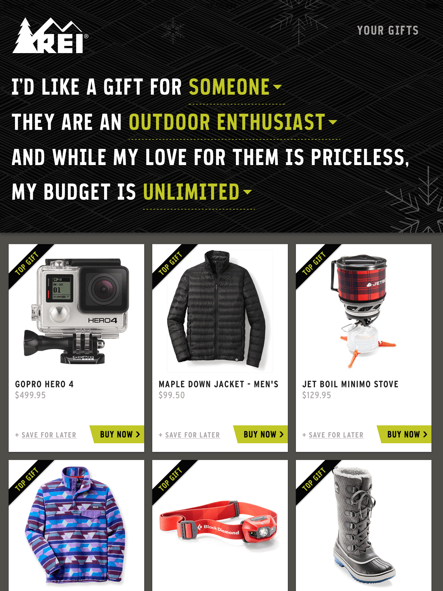
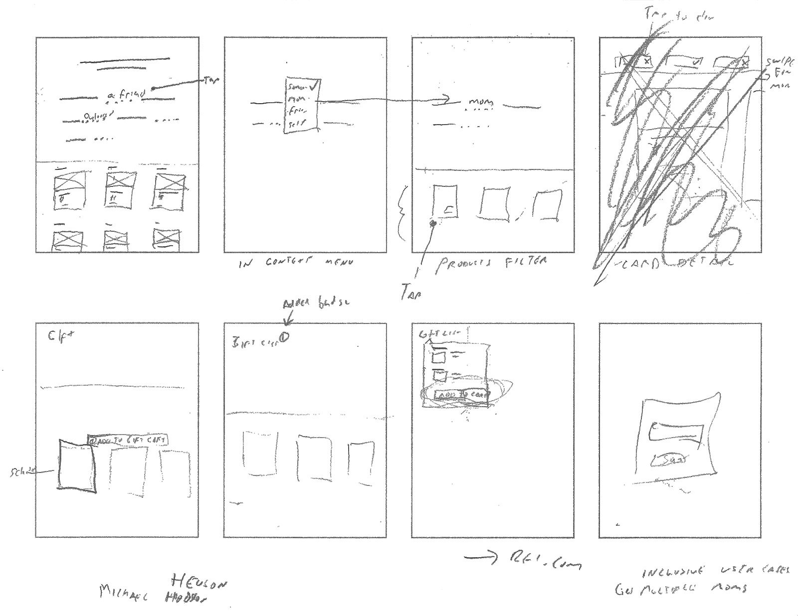
Some of our crazy ideas included Mad Libs, a choose your own adventure, a product picker, multiple variations of games involving Angry Bird’s-like slingshots, and Christmas-stocking ski ball. This exercise sparked some great discussion, and we left the room with a long list of ideas. We used multi-voting to narrow things down and ended up with 3 directions warranting further exploration. I took those and quickly sketched a few three-panel storyboards to flesh out the general user experience. While a couple of the ideas sounded fun, there was really only one that made the most business sense and best met the design challenge given to us. Since REI is known for its expert knowledge and customer advice, we decided to use a Mad-Libs-inspired natural language search filter to help customers find the perfect gift.
The solution
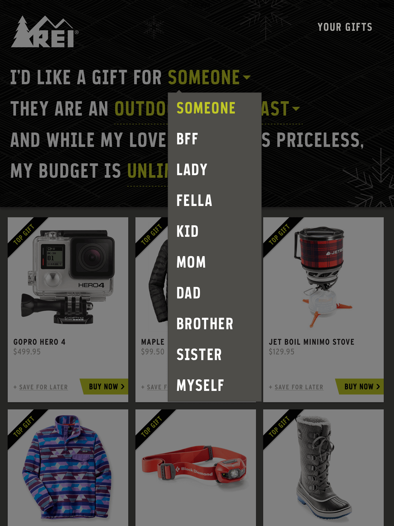
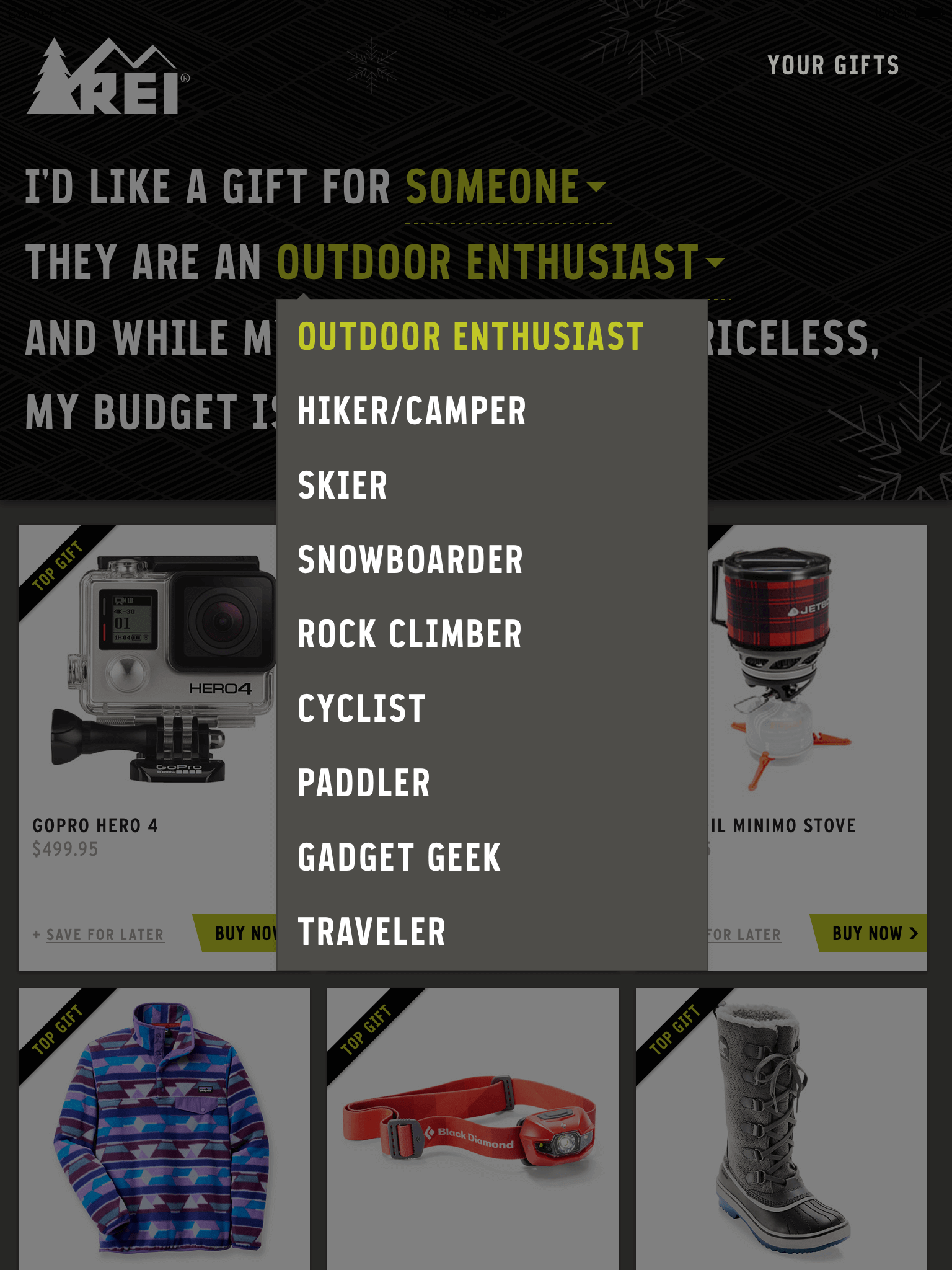
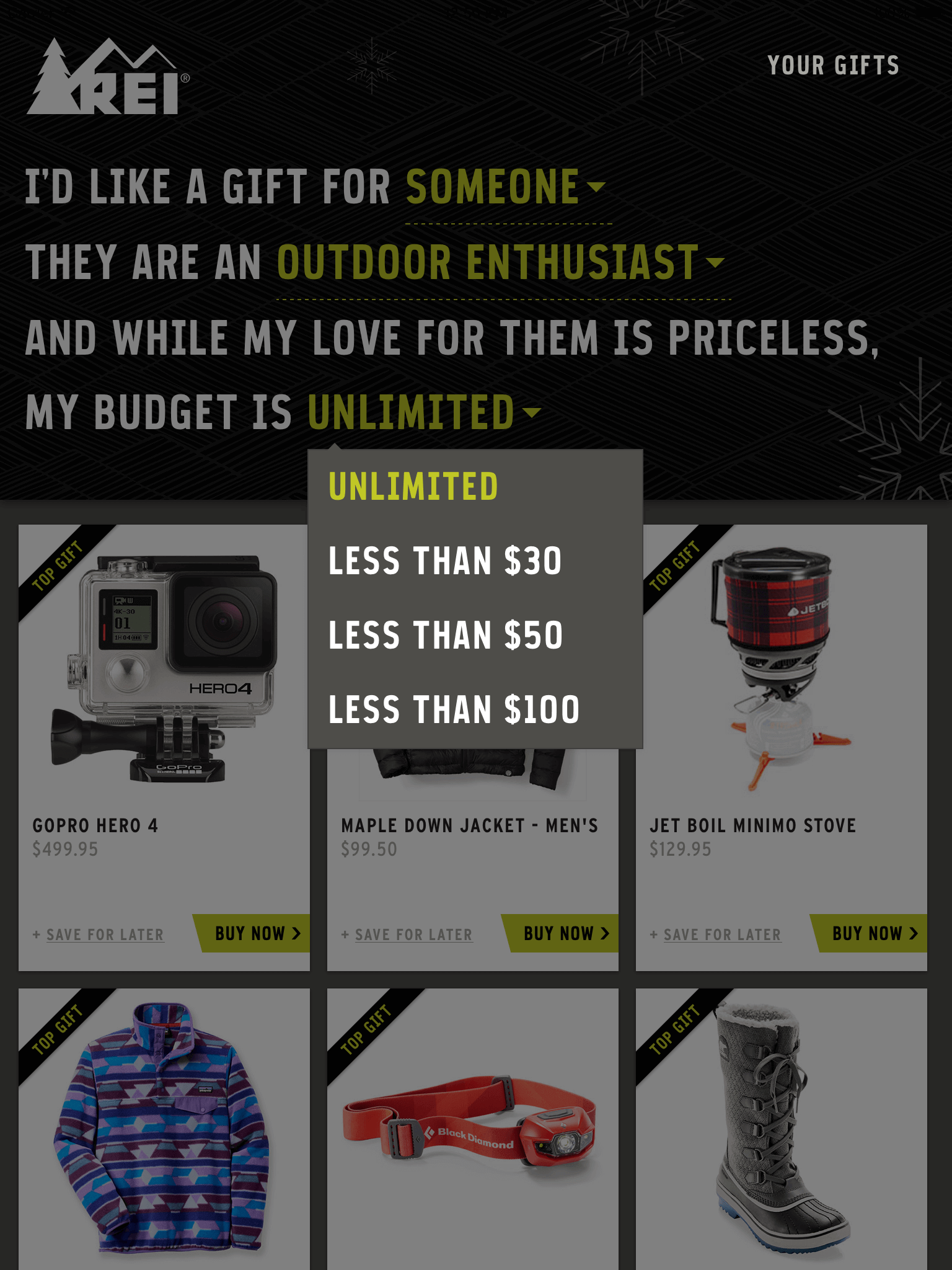
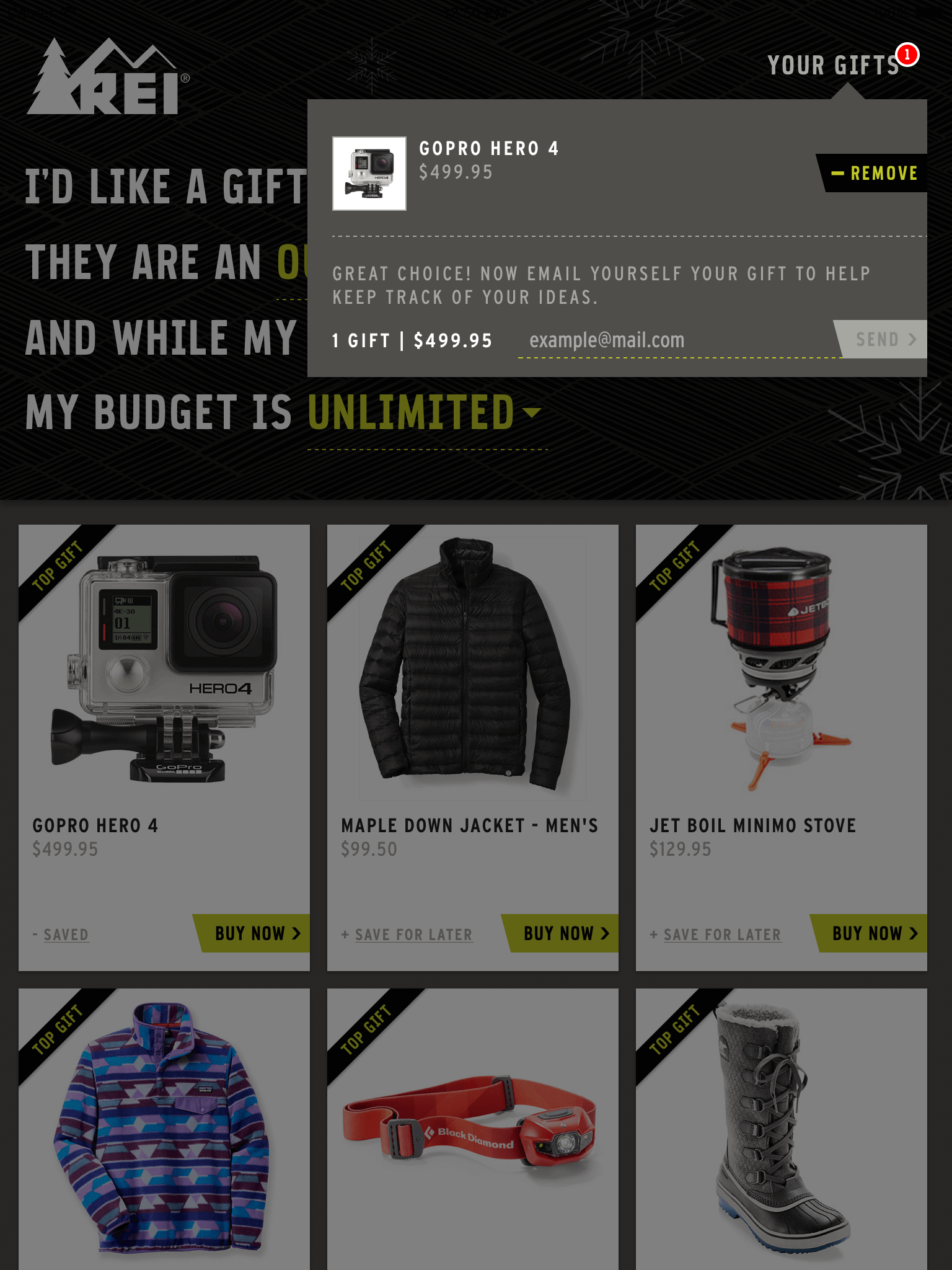
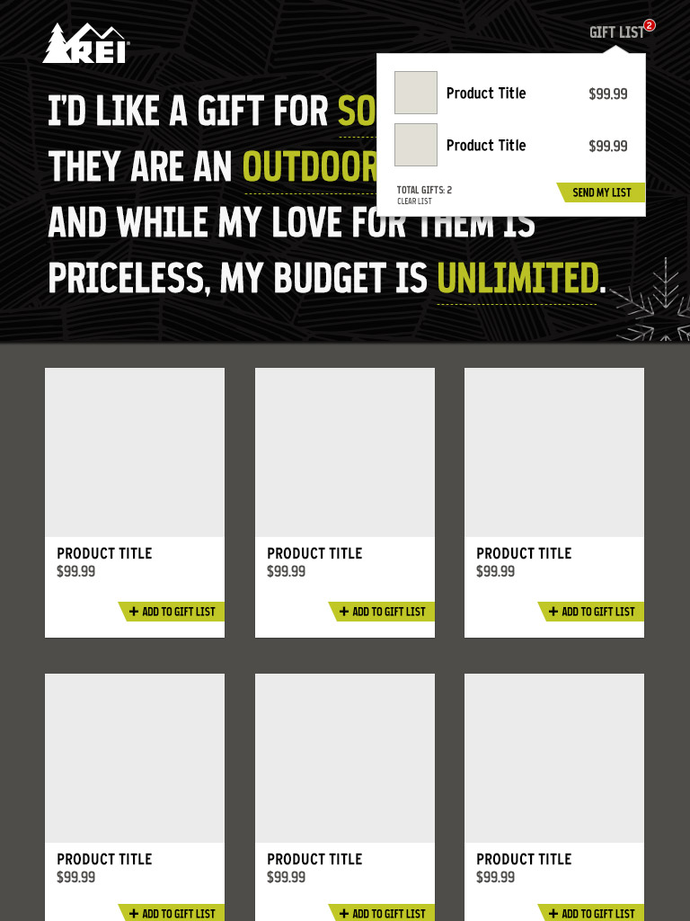
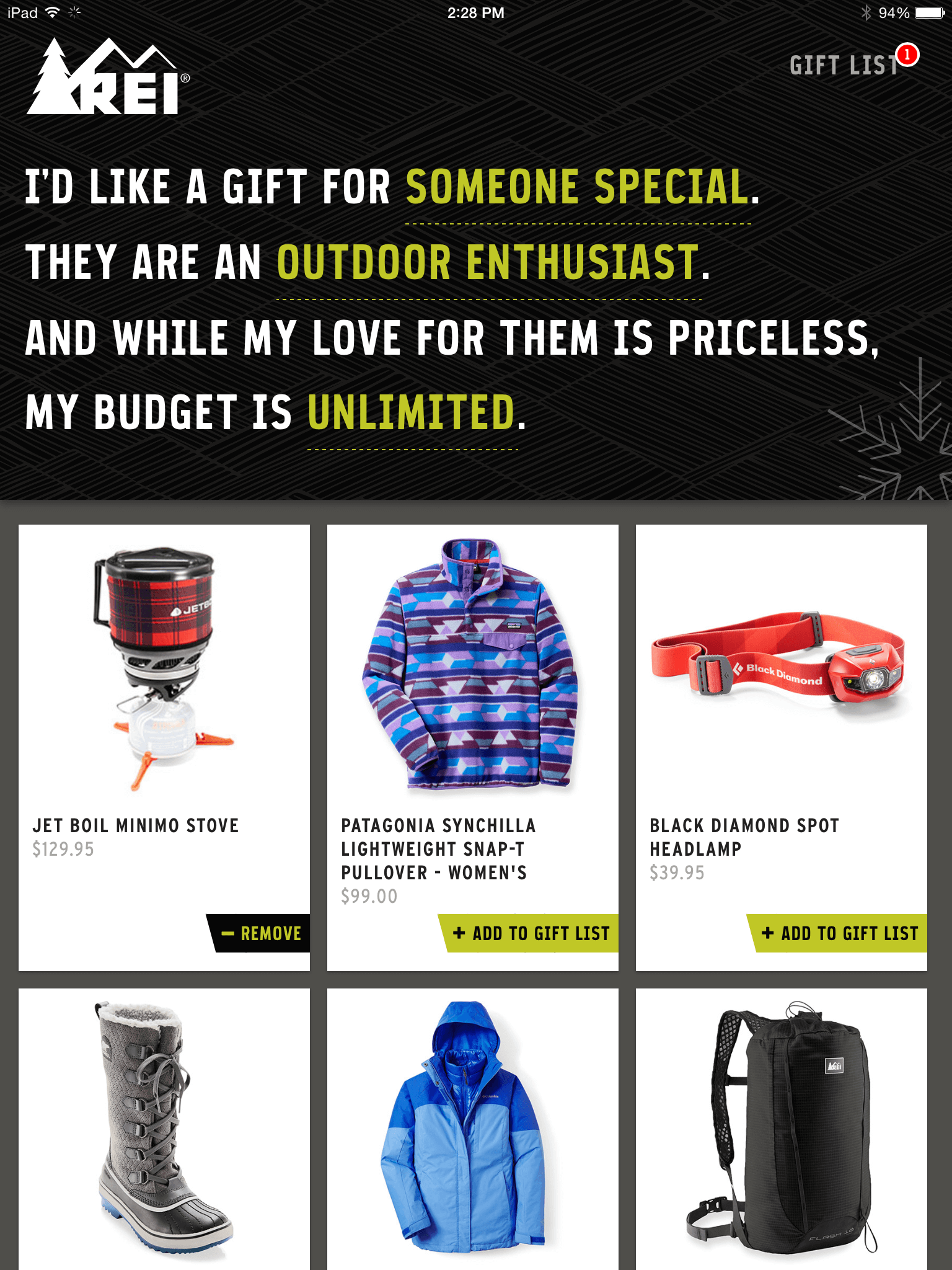
The primary user flow was pretty straightforward. A customer could filter through products based on who they were shopping for (to add personalization and determine gender or age, if possible), what activity this person liked to do, and how much the shopper was willing to spend to secure their love and affection. The products would be displayed in a grid of product cards and, if the customer found something they liked, they could go directly to the REI.com product page or add it to a gift list.
Initially the idea was to have the gift list function like a shopping cart, redirecting them to REI.com when they were ready and letting them complete their holiday shopping in one fell swoop. Unfortunately, integrating with REI systems can be… challenging. So I fell back to providing people with a transactional email they could use for later reference.
After a few more sketches to work out the basic page structure and a static comp to figure out the initial visual design, I jumped into code and finished the designs in the browser. This had a couple of benefits: To start, it let me prototype basic functionality that lead to a much faster review cycle and allowed me to get sign-off from leadership. As they say at IDEO, “If a picture is worth 1,000 words, a prototype is worth 1,000 meetings.” Also, I could easily make small tweaks to margins, paddings, and typography. It’s the fastest way to figure out things you might have overlooked.
The right tool for the job
The magazine’s publishing platform is actually a plug-in for InDesign. It has fairly basic functionality out of the box for things like slideshows, hotspots, and even 360° product views. It’s great for simple interactions, but it’s fairly limited and definitely wouldn’t work for what we were trying to build. Fortunately, it allows you to embed HTML and all the features of the modern web along with it.
For this project, I needed a framework that would be easy to implement. I developed a similar ad a few months earlier by hand and had gone through the very tedious process of copy-pasting the same code again and again and updating classes to use as JavaScript hooks. That ad only featured 30 or so products this ad would have over 300. Waaaaay too much copy-paste for my liking. This time around I needed a solution that would allow me to templatize my code while increasing functionality. Behold: Angular. I watched a couple of getting-started tutorials and was blown away by how powerful it was out of the box.
Building the ad as a single-page application in Angular allowed us to do incredible things. I was able to make asynchronous calls to our product feeds to determine price and availability. I could hide products that were below a certain in-stock threshold and update the pricing in real time, while giving special treatment to products that were on sale. I could highlight featured products and integrated transactional emails with Mandrill. It also saved me a sleigh load of time. I only had to write the markup once and then simply update the data model as last-minute changes came through from merchandising.
Re: Legal Review
While prototyping in code made for smooth sailing through leadership reviews, it wouldn’t prepare us for the coming tempest: a final legal review. Our legal team’s primary concern with the ad was the integration of a transactional email. The FCC provides guidelines on what kinds of emails can be sent and to whom. Throughout the process I had incorporate their feedback by adding the correct legalese to the UI, using a separate IP than our primary emails use, and cross-referencing email addresses against our unsubscribe list. I even presented a throughly researched case of the CAN-SPAM act to our lawyer. Unfortunately, this proved fruitless.
The morning I was to send the finished ad to the publisher, I got word that I needed to pull the email functionality over legal concerns. My time for finding an alternate solution had run out. In the end, the gift list was simply for reference. ![]()
Outcome
The REI holiday campaign was a financial success. This project had a small reach given its placement, yet it had a campaign-leading 3.8% click-through rate (CTR). Comparatively, our other interactive rich media placements for this campaign averaged a CTR of 0.06%. Our previous enhanced ad in this publication had averaged a 0.19% CTR. My team and I learned a great deal about the power of formal design exercises and iteration. We overcame the quagmire of office politics and demonstrated our ability to deliver innovative interactive designs.